Dennis Minton
Creative Direction, Graphic Design
This project was completed when I was working full time as a Senior Designer at Procter & Gamble in 2024. I have since gone back and revamped the project to bring to life the concept more holistically versus what was completed.
Epoch UK
Layout & Design for Print, Primary Packaging Modeling and Renders, Formula Visualization.
Olay Regenerist Restage 2024
The Brief
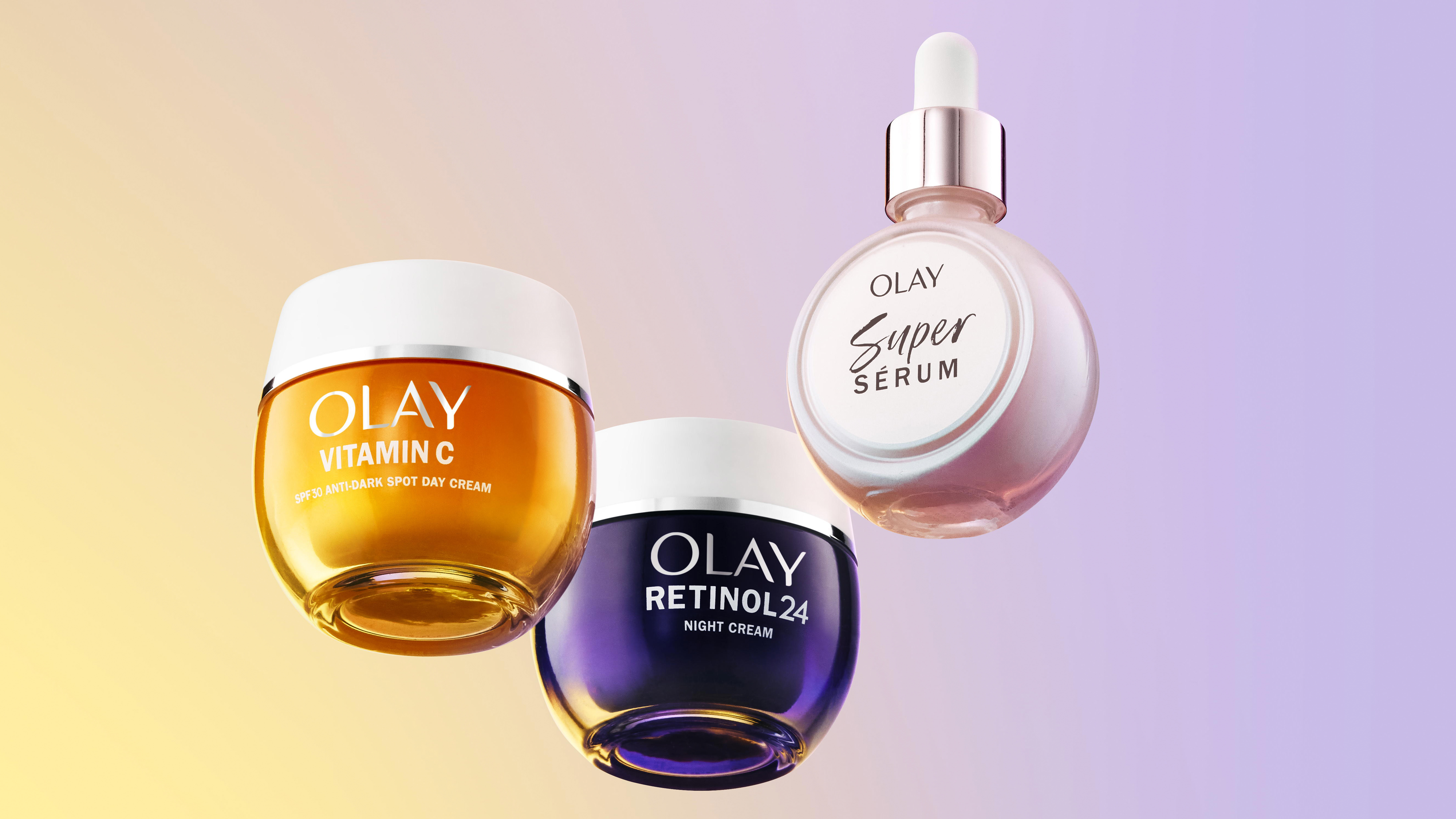
The REGENERIST collection from Olay is the brand's classic anti-aging line up with products across jars, droppers, and serums. The goal of the project was to harmonize the collection through a cohesive design language and modernize with the use of type, color, and updated packaging renders for the FOP. Navigation throughout the collection has always been confusing and difficult for consumers, so it was very important to reduce complexity and bring easy to understand visual category cues for product differentiation that can work in many languages.
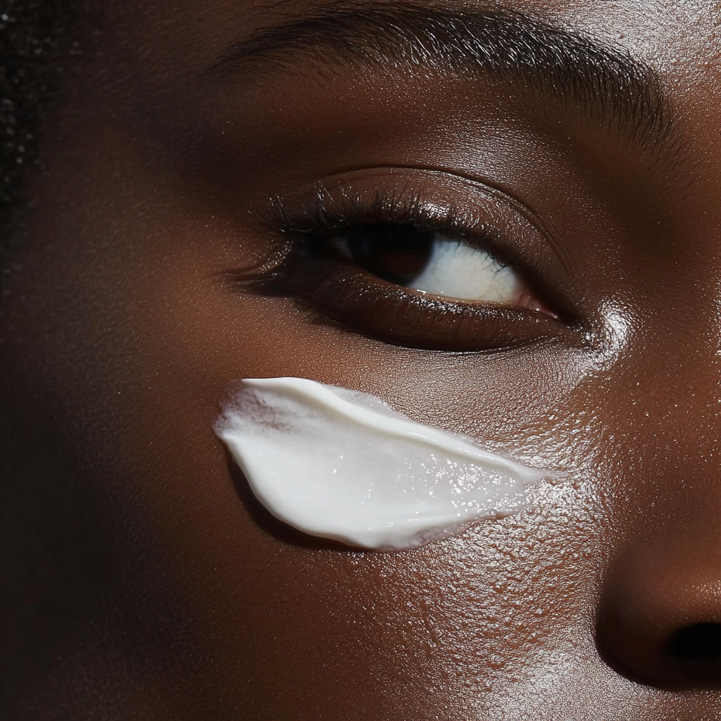
Each panel of the artwork was modernized, simplified, and kept the goal of consumer navigation in mind. Each variant within the line up contains an indicator showing consumers from 1-3 how light or thick the cream is when applied to the face. A realistic product texture render was added to the FOP to help further give consumers an idea of how the cream looks and feels. The whip has an airy foam like texture, the classic a smooth silky, and the ultra rich an indulgent and heavier feel. Through the use of choiceful embossings, foil, and matte, the package quickly became elevated versus the existing options.
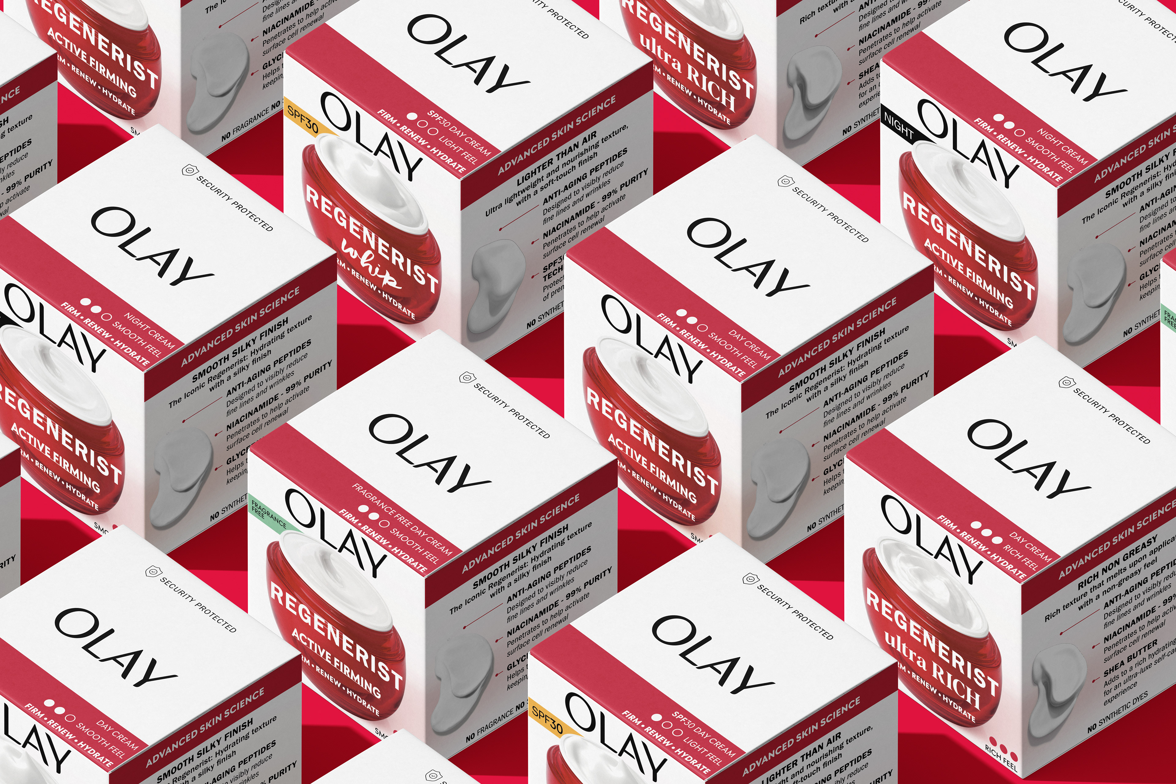
The Renders of the jars, refill canisters, and the textures of the product themselves were re-done totally across the whole line up. This was done to modernize, help further drive differentiation, and give a bit of a fresh look to the outdated hero line up.
The look, tone, and feel of the facial moisturizer jars was then applied across creams, serum, and eye product formats while maintaining a visual harmony and hierarchy to make shelf navigation easier. Prior to this restage, each product form had a widely different aesthetic and organization of copy and many consumers didn't link the products together as one cohesive collection.
Product photography was key in informing consumers that not only did the secondary carton go through a lot of changes, but the primary jar had made a shift from plastic to a refillable, recyclable glass jar. The use of light placed a key role in highlighting the beautiful nature of the glass material, enhanced by colored reflections and refractions created using colored gels and directed light. The introduction of glass not only as a material, but the flute glass in the scene cascades shadows, reflections, and highlights across the jar and lid itself further enhancing our perception that we are no longer viewing a plastic jar but a brand new glass material.
The concept of radiance was then carried throughout imagery of skin with shadows and light playing a key role highlighting the beauty and health of the skin. In this case the skin imagery being used are created using AI, based on my original mood boards. I felt the direction the brand went in with the actual model photoshoot strayed too far from the original design intent, and I wanted to bring back these key elements to ensure a holistic proposition.


